Thursday 31 January 2013
Final Blogging Task!
It's all over!
After months of blogging, research, planning, production and so on; I've finally completed everything. Although this was a fun experience it has also been a very stressful and challenging one. Seeing our music video on the big screen and hearing the audience reaction was probably the best part of the course for me. Overall I feel as though I have learnt a whole load of new things, it has been a good couple of months filled with hard work!
J
Tuesday 29 January 2013
Evaluation Q:4
What have you learnt from your audience feedback?
Overall the audience thought that the Mise en scene, narrative and location was the best part of the music video. Mise en scene is definitely something that my group and I planned thoroughly so I’m glad that the costume aspect and branding of our artist stood out for the viewers. The story line is also something that we tried put a lot of thought into; we wanted the narrative of the ‘Perfect Stanger’ to be easily understandable. We wanted our use of location to be ones you would generally see in a Dubstep music video, this is obvious through the graffiti and urban scenery.
However, some improvements that could have been made is that we should have used more base tracks. “The camera stayed in one place/location for too long” is one of the comments we received. This is something we were aware of but ran out of time once it came to filming. Also, although we wanted our music video to be heavily based on the narrative, having more base-tracks would have helped us during editing as we had to take multiple parts from the same shot to fit the full time of the song; the video would have flown a lot easier.
Another comment we received from our audience is “Emily should have moved around more.” In some of the scenes from the music video you can tell the artist looked a little uncomfortable, this is due to her being camera shy. However towards the end she became used to the idea, looked more comfortable, and you can see a difference in her performance which I’m very happy about and applaud her for this.
Although I am pleased with the work I have put into my products, this does make me look at it in a different light. Putting myself in the shoes of the audience and critically analysing the music video and ancillary work there are a lot of things I would have done differently. Also, if possible I would have liked to put the music video on a social networking site or YouTube to gain response from a wider audience, however because of copyright issues this could not have been done.

Monday 28 January 2013
Sunday 27 January 2013
Thursday 24 January 2013


Evaluation Question 4.
What have you learnt from audience (young adults) feedback?
Rough Cut
The feedback we got during the production side of our music video was really positive. When we had finished our rough cut we showed a few teachers and friends to see what they thought. Putting all the comments together it seems that the whole way through, the thing that the audience like the most is the mise en scene/ location and the costume. It was also reassuring to see that the audience understood our narrative, of ending how we started, right from the first time they watched it, this is one thing we were worried might not be clear but from the comments we received "i liked the way you linked the beginning to the end, the message is really clear" it seems we were successful. The other thing that the audience liked was the camera work, our 360 shot was a definite winner as everyone remembered and commented on it. We didnt get much criticism here and so it was a bit hard to tell what needed improving/changing.
Cinema
The reaction we could when our video was screened in the cinema was positive. The feedback from the audience after the cinema visit was even better. It was interesting to hear what people had to say and there were obviously a lot more people watching than ever before. The strengths in our video were the same as i mentioned before, mise en scene and costume, because "young girls can relate to the fashion sense" however the audience also commented on the editing saying that our transitions and rewind effects were really good which was the main concept of our video so we were happy with that feedback. We also got comments on the narrative, it appears that the audience felt our video had more meaning behind it because it told a story as well as promoting the artist. Another thing that was commented on was the performance, where some of the audience thought it was good and engaging, others picked up on the sometimes apparent awkwardness. Something that was really helpful from the feedback we got was that our audience didn't just comment on what was in front of them but helped us look at our video in a more technological way commenting on things such as "the male gaze" and stereotyping of women, questions that we probably wouldn't have focused on as much. There was a comment saying we could have had more edits, which i agree with, i think we played it safe and used a lot of repetition of what we had but perhaps experimenting with new edits could have been quite successful and definitely being more confident in my performance where i was really "smiley" but "could have moved around more", that is something i would act on if i had the chance to re-do my work as i have learnt that it is definitely picked up on as performance is such a big and obvious part of the video.
Evaluation Question 3.
My answer to question 3 is too big to upload directly so i've had to put it on youtube, the link is below:
http://www.youtube.com/watch?v=KjRTAaGE2kY&feature=youtu.be
http://www.youtube.com/watch?v=KjRTAaGE2kY&feature=youtu.be
Tuesday 22 January 2013

Ancillary Production - Making Advert
After finishing the digipak cover i started on advert. I started with the same image as planned on my mock up which is the same as the album cover. I wanted to use the same image to ensure that people could recognise the artist and become more familiar with the album, i also liked the image because it was a close up of her face. However the image was portrait and the layout did not look like a professional advert for an artists album but more for a single. I then experimented with other images we had taken as a group and found one that i thought would work really well in a landscape advert. I then put the same filter on Rollip on the image and imported it into photoshop.
.jpg)
.jpg)
Now i had found an image i was happy to use i began to make my advert. It was a very quick process because i knew exactly what text i was wanted and where to position it. I copy and pasted the text from my album cover and placed it in the top left hand corner with the album name and 'out now!' I then placed the album cover in the bottom left hand corner, this was essential so potential customers would recognise the cover if they saw it online or in a shop.
Next to the album cover i placed logos for facebook, blackberry and twitter with the addresses next to them to promote the artist virally. The last thing i added was a quote from 'TimeOut' magazine with their rating. I am happy with the advert and will look for things i can possibly improve.
Ancillary Production - Making Digipak
After using Rollip i then imported the filtered images into photoshop and added the final touches to the front of my digipak. I adjusted the hue and saturation to make the images look more purple which is the chosen colour by our group. I then made a change to the artists name to make the shadow the same colour as the background on the back cover by using the pipet tool on photoshop, i also changed the blue so it was a similar blue to the one created by the filter.
I then added the SonyMusic, Columbia Records and copyright logo along with copyright text for the album and a barcode with the website underneath. I also changed the basic blue spine by enlarging the image on the back cover to it went over the spine, this made it look less basic and much more professional. I then added white text to the spine to stand out over the dark background in the same text as the artists name.
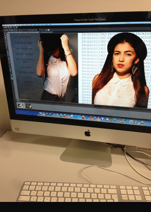
Here is a screen shot of the front panel of my didipak after i made the changes.


I then added the SonyMusic, Columbia Records and copyright logo along with copyright text for the album and a barcode with the website underneath. I also changed the basic blue spine by enlarging the image on the back cover to it went over the spine, this made it look less basic and much more professional. I then added white text to the spine to stand out over the dark background in the same text as the artists name.
Here is a screen shot of the front panel of my didipak after i made the changes.

Inside Panel
After finishing my outside panels i started on the inside. I used the same image from the mockup and used the same filter on Rollip and then added the same effects in photoshop to ensure it goes with the other images on the front panel. One change i have made since the mock up is enlarging the image so it covers both panels, i did this because the right panel looked very plain with just text. It worked well because half of the image is of 'Emily's' hair swinging behind her so on the left panel is her face and on the right is her hair with a cd template with artist and album name on top in the same text.

Ancillary Production - Extra Programs Used

After looking through all the effects on Rollip i really liked the 'Vintage Express' filter and downloaded it to see what it looked like in photoshop. The effect worked really well and would be a great help to get my image to match the genre and the chosen colours that were decided as a group. It helped me create a base for my image where i could then add extra filters once in photoshop.

.jpg)
Ancillary Production - Making Digipak
Front Panel
I have started putting together my digipak using photoshop. Getting my chosen pictures in is the first step, after looking how others look on the template to see if another image would be better i decided to go ahead with the ones i originally chose on my mock up. When placing the photos in i had problems getting them the right size because they were originally portrait so i had to crop the image then drag it onto the template and then enlarge it.
My next step was to begin putting effects on the image i started by adjusting the colour saturation and playing around with the different filters. I was having problems because whenever i got one of the images with the right colours which matched our genre i would find it difficult to create the same on the other image. After having more problems i decided to get on with the other aspects on the digipak and come back to the image last so i did not fall behind.
I then started on the text for the digipak, originally i planned to have two different texts for the artists name and album name. However after experimenting with different texts and seeing what they looked like next to each other i decided to use the same one on both. The text i chose is called 'Futura' it is different from the text i originally planned to use on my mock up i is more basic and clear and works better with a idea i wanted to use. For the artists name i duplicated the layer and changed the colour to white i then placed it under the original blue text so it acted as a shadow. The album name was then placed under the artists rather then in the bottom centre which i planned in the mock up, it suited the cover much more in this position. The text on the back of the digipak was in the same text as the cover and the same blue as the artists name, the position was not changed from the mock up and it was placed on the left hand side.
For the front panlel of the digipak i think i started well however i still had some problems to address. The images still had to have matching effects and to a standard that i was happy with, also i still had to include various logos and copyrights. I am also not sure what image to place on the spine at the moment i have made it the same colour as the text for the artist however it looks out of place and very plain.
Monday 21 January 2013


Sunday 20 January 2013
Ancillary Production- Making inside digipak


For the inside panels of my digipak i wanted to be more creative than the outside so i experimented on photoshop. what i did was put a picture of the artist on one side of the panel and the next thing i did was copy the orignal picture and flip it horizontally and change the opacity. I also experimented on placeing the artist name on the corners of the digipak and ever tried the flipping effect, hoever in the end i chose not to do that. Finally i added the disc slayout on the right side of the digipak and and changed the opacity. On the disc i also layed out the artist name and album title, carefully selecting font size.
Ancillary production- making advert


For my album advert i chose to use a different picture than the one i used for my digipak to promote the artist more and more of a brand image, but i also chose to use the same filter that was used on my digipak so the audience can see a visual connection. For my advert i kept to conventions by useing the same font that was used in my digipak to display the artist's name and album title, i also put a picture of the front cover of the digipak so its easier for the audience to know what to look for when purchasing the album. I started to put ogos of where fans can buy the album, for example the HMV logo. Lastly i made sure to display in bold the the album was already avaiable in stores so fans can go and get the album. However i still have a number of things to do on my advert such as artist website and record company logo.
Tuesday 15 January 2013
Ancillary Planning - Advertisement

I think the advert looks good in portrait but when coming to the final piece i will experiment in photoshop with a landscape advert an possibly other pictures.
Ancillary Planning - Album Cover
This is what i plan my digipak to look like. However i have some ideas which i would like to experiment with in photoshop where i will possibly use more text on the front cover behind the artist. I have chosen a close up image of the artist to make it an easily recognisable product for her fans. It is a clear image of her face where she is also wearing the hat which is featured in the music video. By using the hat it will create a connection with people who have seen the video making it easy for them to recognise the artist and purchase the album. The text used for the artists name 'Emily' is the bold and clear, i will place it in the top left hand corner making it the first thing a potential customer will read. The album name will be in a different text to the artists and will be placed in the centre of the cover at the bottom so it it will be a white text so it stands out on the dark background.

On the back of the album cover i have also chosen an image of the artist in the same outfit and again with the hat but this time she is holding it over half of her face. I think this picture is a good for the back because the image is clearly still the artist. The track list will be on the left hand side and will be in black against the white and also the same text as the album name. The Sony Music logo, barcode and copyright logo will be placed in the bottom left hand side.

The Inside of the digipak will consist of a image of the artist looking back. I am going to try and enlarge the image so it will cover with sides of the inside the digipak. I think this will look good with the image because half of it is of her hair which will cover the cd holder her face will then be on the other side. I plan to use effects on photoshop on all images used on the digipak and will have the same on each so they go with each other and dont look out of place.
Monday 14 January 2013
Production - Making of the Digipak (Advert)
For the advert i experimented using the same style and design with two different images to see which one looked best, although the image of me looking away feels a bit more relevant to the pictures on my album, everyone who compared the two said that the front- on shot was a lot more effective and engaging/eye catching, therefore due to popular demand, i have chosen to stick with the front shot! I used the same font on this advert as i did on my album design however when i had the font in black, it wasnt very clear as my background is quite dark (because of the Rollip filter i chose) so another suggestion i was given was to keep the font but change it to white which did indeed make it much more legible and clear.
Sunday 13 January 2013
Production-making digipak on photoshop
Editing on Photoshop- front panel
i have started to edit and create the layout for my digipak on Photoshop and started using a range of editing tools. The first thing i did on Photoshop was placing the same photos i used for my mock-up on the panels, however i realised that because the pictures was taken in portrait that it wouldn't fit on the panel properly in its original size so i had to enlarge it and crop around it.
The next thing i did on Photoshop was changing the filter of the photo on Photoshop so it matches the genre and chosen colors that was decided as a group. To get the effect and filter i wanted i used the 'Gradient tool' and selected a 'the gradient map' then 'purple and violet duo tone , i was then able to select the colors i wanted which was purple and pink.This process had to be done for each photo seperatly to it was important i got each color and opacity right.
The final step i did in the lesson was adding text. I put the artist name and the name of the title on the front cover and at the spine of the digipak, with the artist name being in larger and different font. I chosen the layout of the font different to what i used on my mock up of the digipak because i felt that the artist name should be displayed first before the album title so fans know who the artist is.
For the front panel of my digipak i still have of number of things to do before i move on to the inside panel;
- song list
- barcode
- record label
- website
- copyright label
Saturday 12 January 2013
Thursday 10 January 2013
Production - Making of the Digipak (Album)
The slideshow order is backwards. Last image should be first.
These pictures document the process of the production side of my album cover. Overall i stuck to the structure of my mock-up, i only changed the image on the left hand side of the inside panel. The version of Photoshop that we had access too wasn't the best and didn't allow me to add all the effects that i needed to in order to come out with the style of album that i was looking to create, we used Photoshop Elements and I am only familiar with Photoshop CS5. In order to get the right coloured filters and effects on my images, i ended up having to use a photo filter website called "Rollip", the website was really useful as it enabled me to create the styles i wasnt able to using Photoshop Elements, there was a large selection of filters to chose from and there were various ones that went with our dubstep genre theme, however, the quality of the photos (lightness, darkness and focus) made a big difference on which filters i was able to chose from as they are quite bold and often made the picture too dark. I chose a vintage styled filter that i then used on all of my images to keep them looking the same, then i edited the colour balance on P. Elements to give them a pinkish tint which is one of the colours from our dubstep colour scheme.
There were a few fonts that i liked, particularly Base 02 and Birth Of A Hero, which were very similar. i decided to go with Birth Of A Hero simply because i felt it was more legible whilst it still had a rough look to it.
Friday 4 January 2013
Subscribe to:
Posts (Atom)