Friday 21 December 2012
Wednesday 19 December 2012
Ancillary planning- Advertisment mock up

so fans can connect to the artist and recognize the upcoming artist.

Ancillary Planning- Digipak mock up
This is the mock of my digipak by just putting images and fonts together. So far this is how i would want my images and font to displayed on my digipack, although i may make some changes when it comes to making the final product on Photoshop I have chosen to do a six panel digipak because it is a new artist so it will take time to for them to be well known, because popular artist such as Rihanna and 2pac used a 6 panel digipak because they are well known and more to give to their fans because they have a wide fan based. Also looking at the majority of dub step albums are 4 panels rather than 6.

For the cover of my digipak i chose to use this image of the artist because the audience can clearly see the artist and make visual reference to the music video with the use of the hat and clothing. One of the problems i had using this image on my mock up was that it did fit the panel completely this may be because the picture was taken portrait instead of landscape so it was was harder to cut the image into a complete square without cropping too much. I chose to put the artist name at the bottom of the panel and the name of the album at the top. one of the reasons i did this was because of the size of the font. i wanted the name of the artist to be bigger than the name of the album because i am promoting the artist and making awareness. however when making the final product i want to have the name of the artist before the title of the album.

For the spine of my digipak i will like to have the name of the artist and the title of the album so it can be easily be seen.

For the back of my digipak will be the track list listing all the songs on the album so its clear for fans to see what songs are included. I chose to use this image because it shows a care free side of the artist also creating a clear visual link to the music video with costume. another reason was because there is a clear space at the side of the image for me to put the tracklist. However i may want to change the laying of the tracklist and the size of the font so it doesn't block the image. At the bottom of the panel i used codes of conventions such as barcode, copyright logo and record company logo and artist website.

The inside of my Digipak will include a scion for the CD and on the other panel will have another image of the artist to promote brand image. However while making this mock up i thought the inside panel looked plain so an idea i ha was to use the image of the hat on the CD itself or under a clear cover so its visible.

Monday 17 December 2012
Album Cover Mock-Up
This is the actual mock up i made once my digipak photoshoot was complete. I am going to use this as my starting point but once i get on to photoshop i will experiment with other photos aswell to see what looks best. The two panels i am certain i want to stay the same are the one with the hat on it (where the CD is going to go) and the back panel with the track listing as i think they are both really strong images that will fit well with the kind of composition i am looking to make for my album.
Friday 14 December 2012
Ancillary Planning - Photos for digipak and advertisement
These are the photos I have decided to
shortlist for my digipak and advertisement. I choose these particular photos
because I think they well go best with the designing of my ancillary work, taking
into consideration where I want to place my text and how they will fit on the
frame. I have a range of shots of our artists, which will help with promotion
and representation. Four out of five of my shortlist photos include Emily
wearing a hat. The hat is used a motif throughout the images which also creates
a visual link as Emily is seen wearing that exact hat in the Perfect Stranger
video. The styling of the artists is something that the target audience can
relate to and is also very similar to how she is shown in the video, which is
an easy connection to make.

Shortlist of Photoshoot Images.
Here is a shortlist of some of the images that i am looking to use for my ancillary work. I've chosen images in which i am wearing the hat to keep the link between them all and the music video in which i am seen wearing the same hat. I want the picture of the hat alone to be on the panel where the actual CD goes and for the image to cover both the background and the CD. Ive gone for images where i am placed either to the left or right as i personally feel it gives me more space for editing (adding mirror effects etc) if i was to do that.
Thursday 13 December 2012


Ancillary planning- shortlist of photos
Shortlist of photos i plan to use on digipak and advertisement.
These are the pictures i will consider to use on my digipak and advert. As a group we chose to take the pictures in the studio because it promotes the album and artist rather than the single and also to give it a professional look. I chose these pictures to be in my shortlist because i have a range of close-ups an medium shots of the artist. As well as some with the use of props (the hat), the hat creates a visual link and reference to the music video and also a brand image of the artist suggesting her sense of style. I chose to include a picture of the hat so that i can include it on the inside panel of my digipak rather than all panels being photos of the artist.
Ancillary group design ideas
Digipak:
- Font - White/Black
- Artists name - Emily
- Colour Scheme - Black, dark blue, purple/pink
- Graphics - None
- Song Title - Broken Record
Advertisement:
- Font - White/Black
- Artists name - Emily
- Colour Scheme - Black, dark blue, purple/pink
- Graphics - None
- Song Title - Broken Record
- Web address - www.SonyRecords.com/Emily
- Logo - Sony
- Date of release - 17/01/2013
Ancillary Research - Class Discussion
Why are CD covers still used despite CD sales dropping?
With new technology CD covers are not as popular as they were, there has been a decrease in CD sales since new technology has flooded the music industry. Most people in todays society download their music either illegally or legally. Despite this CD covers are still used because they give the fan a bit more than just the music. It reaches out to the wider audience and devoted fans giving them a sense of value for money, they get extra things like the lyrics and photos of the artist. It is also good promotion and is tradition in some music genres.
How important are ancillary products to the artist and the industry?
They are very important to promote the artist because CD sales are dropping and they cost more so they make more money for the industry. They help new artists get their face out there and creates a deaper connection between the artist and fan.
How significant is the music video in todays market?
Music videos are vital to promote a major artists new single. Even though there is no profit from a music video it is still essential in todays market. People used to view music videos on TV but now the place where people will see music videos is through sites like YouTube they help artists get known internationally. It helps the artist become more memorable and really helps to get their face out there. Not only is it a promotion but is a way of entertaining and engaging with the audience.
Tuesday 11 December 2012
Ancillary Research- Advert in the papers
Bruno Mars advertisement for album
on my way to college i found a music advert for Bruno Mars in the Metro newspaper. The page is layed out of a poster advertising his new album 'unorthodox jukebox'. Although Bruno Mars is not in the same genre as my artist i really lie the font used for the artist name and album title, both completely different. I think the layout is simple but it stands out and it clearly has an image of the artist making it recognizable for the fans, because on the album itself an image of the artist is not used but the gorilla in the background is the image used for the cover of the album so the is links to the album and advert. However the layout and structure was too simple as important information such as release date of the album was not mentioned anywhere on the poster, which is an convention for Advertisements.
Advert in newspaper

The album 'unorthodox jukebox'

Monday 10 December 2012
Ancillary Research - Idea's for font
So far by, looking at the list I like Mainlmovo, Palatino and Trajan. However when it comes to actually creating my digipak, I will go with the font that will best suit and also one that my group is happy with.

Ancillary Planning-Do's and Don'ts' on design work
Do's
- Use clear font
- Use appropriate sizes for image and font
- Use clear photos that are in focus
- Use a layout that follows the rule of thirds for composition
- Use type face that follows genre conventions and be clear from a distance for fans to see
- Follow the conventions of the 3 color rule and use color that is appropriate for images, font and background
- Think carefully about how i use and integrate fonts,text & language and image together
- use appropriate industry logo's and conventions properly positioned such as Bar code, release date, copyright, titles and artist name
Don'ts'
- Stretch the images to try and fit because this will make them out of focus
- Use layer styles
- Use Unnecessary effects. Any effects use must fit the genre
- place text across artist face
- use unappropriate font styles
- Feel that i need a separate photo on each panel
Practicing The Mock-Up For Our Ancillary Work
In today's lesson, the task was to get started with our ancillary work mock-ups, however, our group haven't taken our pictures yet therefore we experimented using existing images of the "artist" instead to not waste the lesson and help us get rough ideas of sizing, backgrounds, fonts, colours, composition etc.
Research Into Dubstep Ancillary Artwork
We did some further research into album covers for existing dubstep artists and artists of a similar genre. We found that most dubstep album covers don't include images of the artist or atleast not in an obvious way, this is a convention that we have to go against as our artist is upcoming and we have to promote her in the best possible way.
The common link between all these album covers is that they use similar colour schemes. The blue's, purple's, black's and pink stand out the most as it reflects the night life/club vibe. This is something we're going to take on board when creating our digipak by editing the saturation and adding coloured filters.

Sunday 9 December 2012
Ancillary Research - Analysis of Album Advertisement
This is the advert/poster for Tinie Tempah’s Discovery. Although there isn’t a picture on the actual poster of the front cover for the album, the same image has been used and takes up most of the page. A strong point that I thought was very modern and fit for todays society is the QR Code. This is an extermly quick way to download the album and all you do is scan it with your smart phone. I think they really thought of the target audience, taking consideration that we are known as the generation of smart phones and technology. You can also download it from Itunes and it gives you the link to the website which is at the bottom.

Ancillary planning- ideas links to existing ancillary roducts

I came across Demi Lavato's album 'unbroken' and i really like the layout of the album cover because i have similar ideas on how i want the cover of my digipak to look. I like the the use of the enlarged image placed on one side of the cover and the artist looking away, with a glimpse of the background. For my digipak i would like something similar with the artist Emily but the background to be blurred making her the main focus and some space to put the album title and Artist name. Although Demi Lavato is not in the same genre of my artist i feel she has a similar look to Emily and i can see some connection.
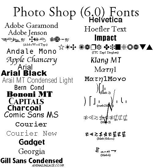
Ancillary Research- fonts on photoshop
I decided to research what style of fonts are available on Photoshop so when it comes to making my Digipak i will know exactly what what options i have. By looking at the list i can create a shortlist of fonts that i can use on my digipak rather than looking for a front and realizing its not available on Photoshop. Personally so far i like 'klang MT', 'MATH E', 'SKIA' and 'NEW YORK', however the font has to be decided as a group so i will show the list to my group and we will pick a shortlist of fonts together to use for the digipak.


Ancillary Research- Analysis of album adverts
Example- 'the evolution of man'


So far i have seen 3 advertisements for Rihanna's album 'loud', i think this may be because the artist is well known so more money is used from the industry to advertise her album Another reason for this may be because Rihanna may be trying to maintain a certain brand image because her fans expect something extra from her so the industry advertised a number of different posters for one album. The first advert is a video advert that was both available on TV for example MTV and also online such as YouTube. The video advert included visual links to both the album cover and clips used for her music videos, i also realized they kept her brand image throughout all the clips so its easier for fans to recognize and connect to advert immediately. The artist name and album in mentioned in the video and and image of the digipak at the end. There is a clear visual link and repetition through the use of the color red that is used in her music videos, the album cover and the advert.
The two posters where displayed on walls, such as underground etc. similar to the video there is clear visual links and repetition of colors used on both posters. however Instead of featuring on image of the digipak, on the first on the image used for the cover on the digipak is enlarged, whereas on the second poster the image used was taken from one of the locations that she used in her music videos. The font used on both posters are the same, especially the name of the artist and album we can see the separation between the letters that was used on the album making it easier for fans to recognize. The posters does include a release date and hit singles but does not include record label and website and information. Rihanna may not relate to the genre of my artist directly but i feel she may have the same target audience of teens and young adults. Further more my artist id=s from the UK garage genre and UK garage can include R&B which is the genre of Rihanna.
Chase & status- 'no more idols'
 This is the Chase and status Tour advert that was available for fans. There is a visual image of the album at the bottom left of the poster, however they used the same image of the dog that was used for the album cover and enlarged it to cover the whole page. The is also i repetition of the use of fonts and and color that was used on the album. The is a list of tour dates making it clear for fans when the tour starts, where they will be performing and a contact number for tickets. there is information on when the tickets will be available for fans, and in small font on when the album was released this was done because the release date for the album has already gone. Also in small detail at the bottom includes website information and record label logo. I chose to look at chase and status album tour advert because the are fro the same genre as my artist.

This is the poster/ advert that was used to promote Example's new album 'the evolution of man'. The poster does feature an image of the digipak on the left hand side, has a release date and where the album would be available to fans for purchase. However there are a number of weaknesses about this poster;firstly instead of having the name of the artist and album in larger font, the is the title of his hit single 'someone to die for'. The poster it self does not include and website information or record label information. Overall i thought advertisement could have been better in terms of information they had put on the poster and also more visual links. Example relates to the genre of my artist because he produces the same genre of music and has similar target audience.
Rihanna-'loud'
So far i have seen 3 advertisements for Rihanna's album 'loud', i think this may be because the artist is well known so more money is used from the industry to advertise her album Another reason for this may be because Rihanna may be trying to maintain a certain brand image because her fans expect something extra from her so the industry advertised a number of different posters for one album. The first advert is a video advert that was both available on TV for example MTV and also online such as YouTube. The video advert included visual links to both the album cover and clips used for her music videos, i also realized they kept her brand image throughout all the clips so its easier for fans to recognize and connect to advert immediately. The artist name and album in mentioned in the video and and image of the digipak at the end. There is a clear visual link and repetition through the use of the color red that is used in her music videos, the album cover and the advert.
The two posters where displayed on walls, such as underground etc. similar to the video there is clear visual links and repetition of colors used on both posters. however Instead of featuring on image of the digipak, on the first on the image used for the cover on the digipak is enlarged, whereas on the second poster the image used was taken from one of the locations that she used in her music videos. The font used on both posters are the same, especially the name of the artist and album we can see the separation between the letters that was used on the album making it easier for fans to recognize. The posters does include a release date and hit singles but does not include record label and website and information. Rihanna may not relate to the genre of my artist directly but i feel she may have the same target audience of teens and young adults. Further more my artist id=s from the UK garage genre and UK garage can include R&B which is the genre of Rihanna.
Chase & status- 'no more idols'

Friday 7 December 2012
Analysing 3 Existing Digipaks.

The first artist who's album i've looked into is Katy B, the artist who we've gotten a lot of inspiration for our work from. I like the simplicity of her album design, the two coloured gradient filter is really effective and doesn't take the attention away from her and the boldness and sleekness of her writing compliments the image really well. It is quite common for artists to have close up shots on their album however i do think that in this sense a mid shot is still effective, in our case we would still have to use close up shots though as our artist is upcoming and we want to promote her as best as we can. When going to HMV, i saw that Katy B doesnt have a full digipak (no lyrics, album art etc), its just a CD.

I looked at Rita Ora's album "ORA" because she is a very popular young female artist which is what we'd hope for for our own artist. I like the way that although the image is in black and white, its very bold, the quirky pose also gains the audiences attention. The red writing goes really well with the black and white, it is both bold and legible. I think it is important to take inspiration of the kinds of images that young female artists have on their albums and digipaks just to make sure we get it right when we come to take our own.

I looked at Chase and Status because they are popular artists within our genre of dubstep. As with many dubstep albums, the design is quite graphic, and similarly to Rita Ora's album, the use of bright colour against a black and white photo is an element that really works. Generally, we probably would aim to go for something like this as it would be following the conventions however as i mentioned before, our artist is upcoming and so using pictures of her is essential.
Thursday 6 December 2012
Ancillary Research - Class Discussion
Why are CD covers still used despite CD sales dropping?
- More promotion
- For a wider audience, especially for 'super fans'
- provides a visual benefit
- certain genre's have a tradition of making CDs
- gives a value for money
How important are ancillary productions to the artist and the industry?
- Due to sales dropping it would prove to be more important because more effort has to be put in promoting the artist. Therefore, there is a profit made because it costs more. It also forms a deeper connection between the artist and their fans.
How significant is the music video in todays market?
- Although sales for CDs have been dropping, music video's are still very significant. With the internet and things like youtube being accessible to people in nearly every country is provides for them as a wider audience. It also proves to be more memorable, giving the audience a visual for the song creating an experience to them and maybe even making them feel closer to the artist. With a music video, the song is more likely to get a lot of views giving the artist more recognition. Also the main purpose of a music video is to entertain and make the public more aware of the artist, whether that be a new comer or someone who has been around for a long time.
Subscribe to:
Posts (Atom)