Wednesday, 19 December 2012
Ancillary Planning- Digipak mock up
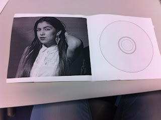
This is the mock of my digipak by just putting images and fonts together. So far this is how i would want my images and font to displayed on my digipack, although i may make some changes when it comes to making the final product on Photoshop I have chosen to do a six panel digipak because it is a new artist so it will take time to for them to be well known, because popular artist such as Rihanna and 2pac used a 6 panel digipak because they are well known and more to give to their fans because they have a wide fan based. Also looking at the majority of dub step albums are 4 panels rather than 6.
For the cover of my digipak i chose to use this image of the artist because the audience can clearly see the artist and make visual reference to the music video with the use of the hat and clothing. One of the problems i had using this image on my mock up was that it did fit the panel completely this may be because the picture was taken portrait instead of landscape so it was was harder to cut the image into a complete square without cropping too much. I chose to put the artist name at the bottom of the panel and the name of the album at the top. one of the reasons i did this was because of the size of the font. i wanted the name of the artist to be bigger than the name of the album because i am promoting the artist and making awareness. however when making the final product i want to have the name of the artist before the title of the album.
For the spine of my digipak i will like to have the name of the artist and the title of the album so it can be easily be seen.
For the back of my digipak will be the track list listing all the songs on the album so its clear for fans to see what songs are included. I chose to use this image because it shows a care free side of the artist also creating a clear visual link to the music video with costume. another reason was because there is a clear space at the side of the image for me to put the tracklist. However i may want to change the laying of the tracklist and the size of the font so it doesn't block the image. At the bottom of the panel i used codes of conventions such as barcode, copyright logo and record company logo and artist website.
The inside of my Digipak will include a scion for the CD and on the other panel will have another image of the artist to promote brand image. However while making this mock up i thought the inside panel looked plain so an idea i ha was to use the image of the hat on the CD itself or under a clear cover so its visible.
Subscribe to:
Post Comments (Atom)


No comments:
Post a Comment